
pingtsai
[PuristSPro Moderator]
2063

Girard Perregaux Cat’s Eye Bi-Retro - an "On-The-Wrist" Review
Girard Perregaux Cat’s Eye Bi-Retro -
An "On-The-Wrist" Review
by Ping Tsai
Seldom does one get the opportunity to try out a new watch and then grow to love it in an uncommitted way. When I first received Girard-Perregaux’s Cat’s Eye Bi-Retro watch, the initial impression wasn’t laden with immediate affection. This was simply due to the fact that feminine diamond encrusted smaller scaled watches are not my preference. However, like a personality that grows on you, or a wine that gets better the more sips you take, GP’s Cats Eye charmed me and won me over. Surprisingly though, it wasn’t even the diamonds.
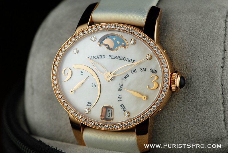
The Girard-Perregaux Cat’s Eye Bi-Retro watch that I had the pleasure of wearing consisted of an automatic winding movement housed inside an oval rose gold case with diamond bezel, white mother of pearl dial, and a white satin strap with a rose gold deployant buckle. It is GP’s version of the typical ladies “white” diamond watch. However, their take is a bit more interesting with a unique dial design that incorporates a nifty bi-retrograde seconds and weekday indicator and a moon-phase indicator. With all that, the watch did little to stir my emotions at first glance. I knew the piece was “beautiful” and that countless women would gush over its appeal. I simply wasn’t convinced by its external offerings though. I needed to explore further, know more, and get to know it better like a new acquaintance with innumerable potential.
A Closer Look – Case & Dial
It’s apparent that GP designed the Cat’s Eye with a broad range of sophisticated women in mind. The elliptical case, which measures approximately 35.25mm x 30.25mm is a perfect compromise between women who prefer traditionally smaller watches as well as those who enjoy larger ones. Since the oval is set horizontally, it covers more lateral surface area on the wrist and tends to have a widening effect, making the watch appear and feel larger. (The same can also hold true for a rectangular or oval shaped diamond. Traditionally, these are set vertically in engagement rings. However, a tip for anyone ring shopping is to try setting these cuts horizontally to make the stone appear larger.) Although the case width stretches the size of the watch visually, the 30.25mm height still keeps it dainty and petite.

GP’s attention to feminine detail is also evident in material and construction. The rose gold tone of the case is warm, regal, not too “pink” and matches well with just about any shade of gold jewelry. The long curved lugs allow for a close contoured fit.
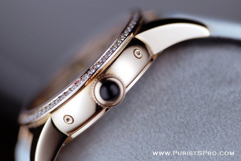
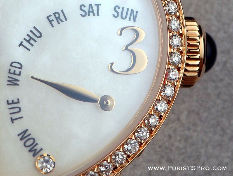
Outlining the oval rose gold case are 68 (a lucky number for Asian people) brilliant pave set diamonds. Six other diamonds are designated for the hour markers at 1, 2, 5, 7, 10 and 11 o’clock. Personally, I enjoyed the understatement of the diamonds. They don’t overpower the look of the watch but merely enhance it with a bit of sparkle.


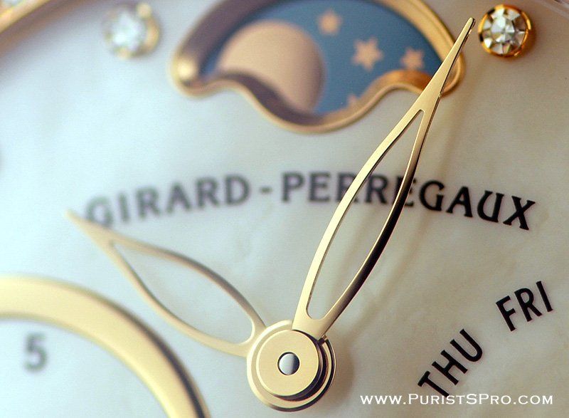
At times, it can be underwhelming to see yet another mother of pearl dial on a ladies watch. Although this Cat’s Eye has unsurprisingly, precisely that, the other complications present on the dial are interesting enough to make up for the commonality of material choice. There is a retrograde weekday indicator on the right side of the dial balanced by a small retrograde seconds hand on the left.

This seconds hand is one of the most unique characteristics about the watch. The hand moves until it reaches the end point of the thin rose gold crescent arch indicating 30 seconds have passed and then immediately flies back to the starting point and begins again. The only complaint would be that since the hand flies back from thirty, there is no way of knowing which half of the minute is being counted. This seems negligible though since I hardly know anyone who lives by the second. The purpose of the retrograde seconds hand appears to be more aesthetically driven rather than utilitarian, and I always believed that any visible, constant moving object on a watch was a desirable and attractive one to have.
There’s also a deep-set date display window at the 6 o’clock position and a moonphase indicator at 12 o’clock. The moonphase window appears to be quite deep-set as well and slightly small in scale. For something that could really make a statement and add a great deal of visual interest to the dial, the moonphase definitely lacks prominence. The celestial designs in the background appear a bit dull. I would have preferred if GP used a different material such as spectrolite or surface treatment for the moonphase background which could add more shine or sparkle.

Radiating out from the center of the dial are the pointed rose gold cut-out hour and minute hands. Leafy, lacey and delicate, they are beautifully crafted and reflect perhaps the most feminine quality of the watch. The more I stared at the hands, the more “organic” they appeared, and I realized immediately that they were my favorite characteristics of the entire watch. Somewhere in their design and construction, their shapes lost their perfectly symmetrical mass machine cut quality and took on a more life-like persona. The effect is both refreshing and integral in adding more drama to an already attractive and dynamic dial.
Caseback
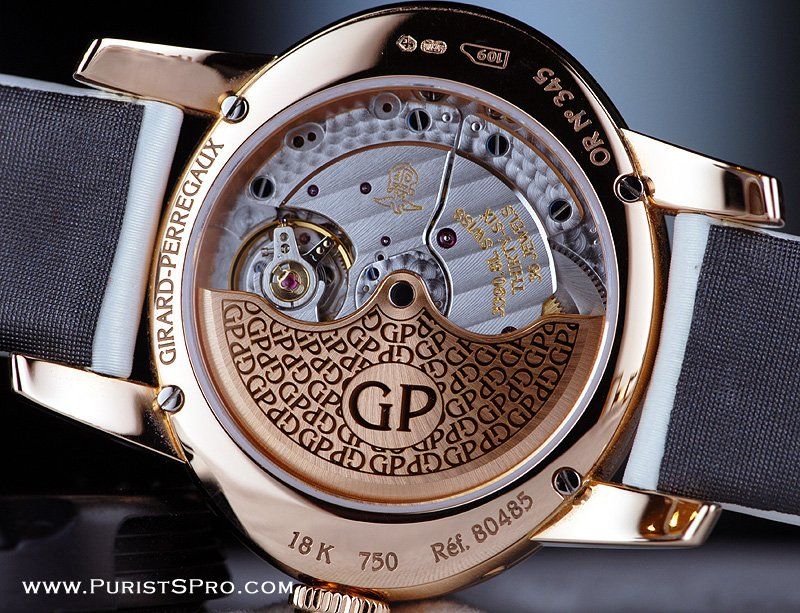
Flipping the watch over to examine the back, I am pleased to see a sapphire crystal caseback which reveals the exquisitely finished GP 03390 movement. The rotor has a repeat pattern of Girard Perregaux’s initials. I actually prefer this branded look of the rotor over something more generic such as Côtes de Genève or simple brushed finish. It reminds me of other desirable and timeless repeat monogram designs such as Gucci and Louis Vuitton which are continually sought after by women all over the world. Giving the watch a slight shake, the rose gold rotor swings freely with absolute ease and efficiency.

Strap and Wear
Fit plays an essential role in the overall success in design of a ladies watch. One can have the most beautiful watch in the world with an impeccably finished complicated movement; but if it doesn’t fit right on the wrist, it just becomes a nuisance; for example, an oversized case that gets caught on delicate blouses or so heavy, it constantly slides off the plane of one’s wrist, a buckle that isn’t placed correctly and digs into the skin, or lugs/crowns that stick out too much and dig in as well. Ladies wrists and skin tend to be softer and more susceptible to sharp angles on a watch. Therefore, designing ladies wristwatches requires a bit more finesse.
Above all, the most important component of fit for a ladies watch is the strap. Even if a watch case is oversized or some of the other problems mentioned above are present as well, the watch can still be wearable if the strap is snug and not too uncomfortable. When it comes to the strap and fit, I’m pleased to say the Cat’s Eye scored huge and got it just right. It is so successful in fact that at times I completely forget that I am even wearing a watch and mistakenly ask someone next to me for the time! The silky smooth white satin strap is flexible and conforms to my wrist perfectly. The rose gold deployant buckle is extremely comfortable as well.
The underside of the strap is a dark grey to make any stains there less apparent. Although the watch can be worn everyday, it isn’t ideal for someone with an active and busy lifestyle. Being a mother with two small children, the buckle did pop off a number of times while lifting or holding my kids. Also, the white satin strap started to stain around the edges after two weeks of wear. There may perhaps be a way to clean the strap gently such as is possible with other watch straps.


In general, the superb fit of the Cat’s Eye with a nicely contoured buckle that I could barely feel is a strong stand alone selling point. That along with the impressive and intricate rose gold design work on the dial and movement are enough to garner my appreciation for Girard Perregaux’s Cat’s Eye and open my mind about small scaled diamond ladies watches. Perhaps predictability can be a good thing when it’s done right. One thing that isn’t so appealing is the $28k+ price tag. It certainly isn’t the priciest amongst similar watches at the same level but not cheap either. Such is the price one must pay for a watch with a brand name, quality movement, diamonds, rose gold detailing and out of the ordinary complications. Whether it is worth it or not is subjective. Those who can’t appreciate the superb detailing of the movement and value workmanship of the complication may prefer to have more diamonds at that price level. And, on the other hand, those who can see past the bling and discover the unique intricacies about the watch and become enamored by them, may not even look at the price tag at all.
I used to steer clear of watches that look similar to the Cat’s Eye. In my opinion, there isn’t a shortage of those around. Practically every watch brand has a white diamond ladies watch in its line. To me, it’s too obvious. Just by looking at it, there’s no intrigue. I feel like the Cat’s Eye wouldn’t say much about me as a person except that I am a woman and I like diamonds. However, strapping it on somehow opens up a world of not so obvious “gems” in the form of moving parts and comfortable shapes. In my free moments I find myself staring at the retrograde seconds hand with half minute intervals of anticipation. Other times I swing the rotor and try to make it go around in a single revolution. In these mindless moments of mechanical interaction and play, the watch plays back, ever so subtly. I can’t help but be captivated and develop a fondness for the little sparkler.
I normally wear watches that are around 38-40mm in width. I have to admit though, that they aren’t always the most comfortable. They often do get caught on my clothing and dig into my skin. It’s a sacrifice I put up with in order to wear timepieces that are both interesting and out of the ordinary. My experience with the Cat’s Eye has taught me just how important comfort can be in the overall enjoyment and appreciation of a particular watch. There’s a certain ease and peace of mind that comes with not having to be reminded of its presence every few minutes that I don’t exactly have with the other watches I own. Since the Cat’s Eye can be worn so unconsciously, it’s also nice not to have to constantly think about scratching it. This watch has certainly enlightened me on many levels and perhaps most importantly is that I realized different watches can be worn and enjoyed for different reasons. They can all have the same likeability and be equally worthy of time on the wrist.
An extremely intelligent “Purist” once asked me, “What can you really say about the Cat’s Eye?”, implying that there wouldn’t be much to comment about on the watch being so simple and typical. After wearing this watch for two weeks, I realized that when you connect with something and appreciate its quality workmanship, when it comes to female luxury adornment and diamonds are involved, there is always much to be said.
Additional Specifications
Movement GP03390
Calibre 11 ½'''
Frequency 28.800 Vibr/h (4 Hz)
36 jewels
Power reserve min. 46 hours
Crown set with a diamond
Anti-reflection sapphire crystal
See-through case back fastened with 4 screws
Water resistant to 30 meters
Case sizes 35.25 mm x 30.25 mm
Case height 10.45 mm
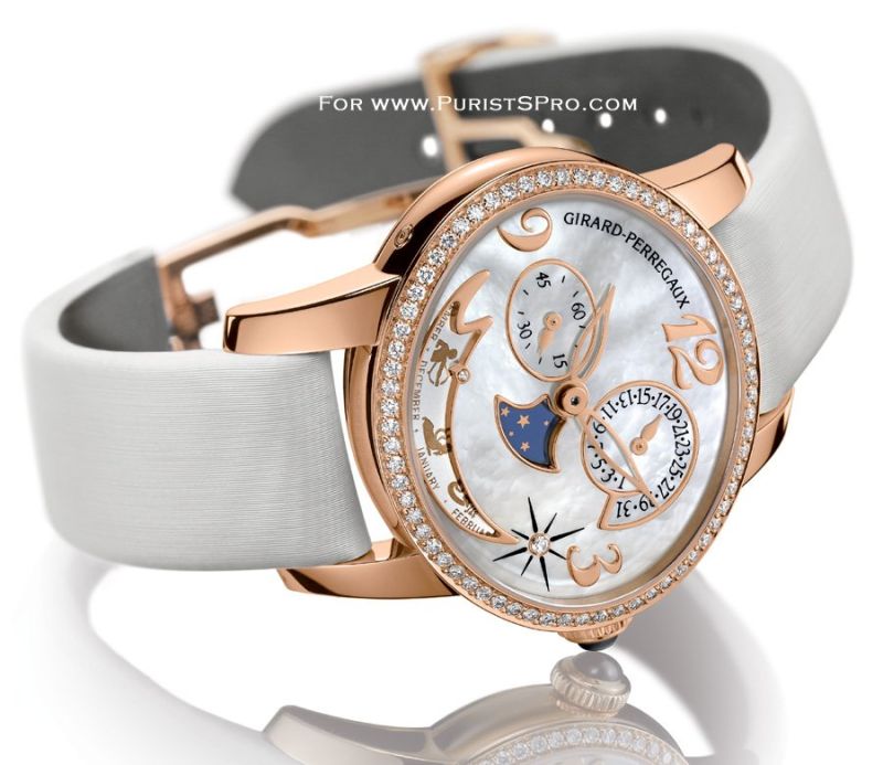
This year at SIHH 2009, Girard Perregaux introduced its newest version of the Cat’s Eye, the Cat’s Eye Annual and Zodiac Calendars. It utilizes the same reliable oval rose gold case, hands and mother of pearl dial. Instead of a retrograde seconds hand, day of the week indicator and date display window, they’ve incorporated a small seconds, a date sub-dial and zodiac calendar window. There’s also a smaller moonphase indicator window that’s more centrally placed. Although the new Cat’s Eye attempts to “change things up a bit” by adding new complications, the elements seem random in their shapes and placement on the dial. Gone are the beautiful symmetry, the playful retrograde seconds hand and sparkling diamond hour markers. Fortunately, the petal shaped rose gold hands still remain as a signature and no doubt, the quality workmanship of the movement as well. The new Cat’s Eye should be a solid performer. However, in my opinion, the Bi-Retro out-shines it with fluidity, balance and character.
Additional Pictures


This message has been edited by AnthonyTsai on 2009-03-31 17:12:54 This message has been edited by AnthonyTsai on 2009-04-04 22:14:45 This message has been edited by AnthonyTsai on 2009-04-12 08:02:11
Girard Perregaux Cat’s Eye Bi-Retro - an "On-The-Wrist" Review

Fantastic review and insights!
Accurate yes, but not issue of precendence for me...

Great job - thanks for taking the time to wear and share this watch
Thank you!

Excellent review on the GP ...

ED-209, if you don't mind me asking...
LOL, maybe I should have asked for advice from her too...
Aaahhh...it all becomes clear!
I'm sure she got exactly what she wanted...
Excellent review!
Thank you for your insight and compliments...

GP should take notes.....
Her inititial response resembled mine...


Thank you Ping!
Thank you Ginger...

Wonderful Review

Great review Ping,
Agree with you on the diamonds...

Superb work, Ping!
You are too funny...


Great review, thanks! Did you think of replacing the strap?
Great idea...
Great review, Ping
Agreed...

Perhaps we share the same experience, Ping, with . . .
I believe we do...

Quick shot of a Maserati...
Thanks for jogging my memory, Michael . . .
My pleasure Art, and you are correct about the Millenary.

A great review of a gorgeous watch! Thank you...
Thank you
Excellent Ping!! My wife Tracie loves her GP...

Great review and stunning photos, many thanks to the Tsai team!

Congrats Ping for this superb review.